Today, We’re Getting to the Heart of Our Mission
We exist to end the abuse of animals raised for food.
 Jennifer Barckley


We exist to end the abuse of animals raised for food.
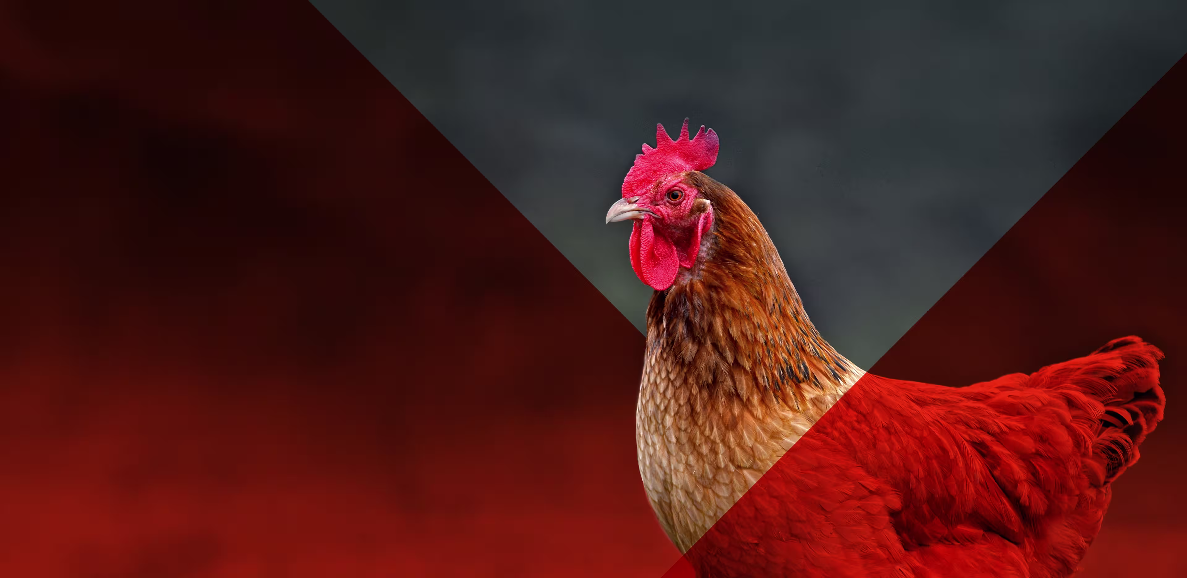


Over the past 10 months, we’ve been doubling down. Reimagining the future for the animals—chickens, cows, pigs, and countless others—who would otherwise be overlooked were it not for you and other courageous, committed people like you.
We began this journey because we unequivocally know that to reach our goal and to take on the world’s largest companies, the savviest of politicians, and the hearts (and plates) of others, we need to rise up, together. To have a shared sense of purpose. To be the change now, more than ever. With boldness. Strength. Courage.
So 10 months ago, we started asking ourselves the hardest, most important questions to get to the heart of our mission. What is our purpose? What problem are we solving in the world? Regrounding ourselves in our “why”—our reason for existing. This journey is culminating today, as we take a stand together. With a stronger-than-ever mission and an emboldened look and feel that we are incredibly excited to share with you.
With this stronger mission statement, we are taking a clearer, more focused stand—intentionally using the words “end” and “abuse” to make clear that the suffering of animals in factory farms every single day is abuse, and it must end.
We are also committed to focusing on “animals raised for food,” giving us strategic and measurable clarity.
Best yet, this stronger-than-ever mission statement came from you. In fact, our entire new ‘face’ was inspired by you—our committed community, including dozens of volunteers, supporters, and staff.
When we kicked off this journey to get the heart of our mission, we began by hearing, reading, and re-reading every word of feedback we received from 79 of you—volunteers, donors, staff, and student organizers. We also sent out and received over 200 surveys from people unfamiliar with The Humane League as we tested our current and new mission statements. Another 200 people shared feedback to our logo concepts.
At the same time, we conducted a robust audit of our current messaging and designs. And, we workshopped our mission for two days—all rooted in the feedback we received from you, our community.
With this mission, tagline, and our existing values as our backbone, we embarked on a well-designed journey with our talented and impassioned team of designers: Cristyn Hypnar and Sydney South, along with our whole Communications Team.
Today, as we share our new “face” with you, we’re sitting down with our Creative Lead, Cristyn, to take us through our design thinking.
We make first impressions and long-term judgments based on the smallest of clues. We scan before we dive in, we see the surface before we experience the substance.
—Seth Godin
Cristyn, you’ve been with The Humane League for three years. Why create a new logo now?
As we explored our “why”—our mission statement—through surveys, interviews, and workshops, it was clear that our existing look and feel did not fully encapsulate the breadth of our endeavors, or the compassionate strength that characterizes The Humane League’s work. We uncovered that our cute green pig led people to believe that we were singular in focus—working exclusively on the humane treatment of pigs. We have also grown as a movement and as an organization since our founding in 2005. Our pig simply wasn’t created to accommodate our expanded focus across our programs, geographies, and cultures.
While it’s easy to think that looks and design aren’t everything (especially as a very pragmatic organization), at the heart of it we are visual beings. “We make first impressions and long-term judgments based on the smallest of clues,” says the author, entrepreneur, and teacher Seth Godin. “We scan before we dive in, we see the surface before we experience the substance.” As such, it is crucial that we visually communicate who The Humane League is in a split second, starting with our logo, and our full visual identity.
How did you go about creating this new logo and overall look and feel?
First, I’m incredibly proud of Sydney (our Graphic Designer) and our whole team for relentlessly and nimbly taking this journey in-house. In doing so, we were able to leverage our experience within The Humane League and the broader animal protection movement—literally bringing heart to it all.
As soon as we landed on our strong mission statement, tagline, slightly updated values, and core personality as a team, we kicked off a rapid and thorough design process internally—rooted in the principles of user-centered design, thanks to the feedback we received from our supporters and staff. As part of this exploratoration, we also studied the identities and approaches of other animal protection and social justice nonprofits, along with notable consumer brands, to define our unique look and feel.
In designing our new logo, our goal was to capture the broad scope of our work as an organization that stands up for all animals raised for food, while empowering others to join us. As I mentioned, we knew we needed to modernize our appearance to convey the contemporary urgency of our mission.
With our new look and feel, we are honoring and visually depicting our unwavering identity as a bold, strong, and compassionate organization taking a stand, for the animals, all around the world.
Can you tell us more about the new logo and the mended heart icon?
![]()
Our icon, the mended heart, represents the broken food system being repaired through our compassionate strength and our relentless work. Together, we break down the walls of factory farming to end the abuse of animals raised for food.
We made the conscious choice to avoid representing a specific animal in our logo, as our mission is to fight, and end, the abuse of all animals raised for food. A heart—the universal icon for love and compassion—is easily recognizable and meaningful across cultures, geographies, and languages. The angular treatment of our mended heart speaks to the shared courage we bring to our work.
One thing that really stands out are the bold color choices. Why these colors?

There’s other new, and quite angular, design elements as well. Why add these in?
Each of the essential components we just spoke about come together with a few additional, design elements—bringing our new look and feel into its fullest expression.

Angled overlays incorporate our energetic color palette into image-based designs that highlight animals and activists—those individuals closest to our mission and our work. And, we quite literally connect the dots with our line-dot treatment that continues to convey movement, action, and our forward-thinking approach.
While I know a lot of care and commitment has gone into this new look and feel, I have to ask, what’s next?
In short, we see our new look and feel as a way to reinvigorate and strengthen our crucial work. We will continue to take on the world’s largest companies. We will reach the hearts and minds of individuals. We will grow the animal protection movement. We will rise up and push forward. With our new visuals, we are poised for growth. With your support, we will move toward a future, reimagined for the animals. A future in which animals are no longer abused and no longer raised for food.
Thank you, Cristyn, Sydney, and our entire Communications Team—Adam, Alanna, Angel, Amanda, Cat, Hannah, Martha—along with our President, David, and every single staff member! And thank you, our community, for inspiring and creating this catalyzing change with us! You are the changemakers! You are the ones who will empower and enliven our mission: to end the abuse of animals raised for food. To see it through to reality.
It’s going to take you. Us. All of us, together. To truly repair our broken food system. To break down the walls of factory farming. And, to mend the hearts of animals (and humanity). Here’s to a bright, and bold, future—together!


About The Humane League
We are a global nonprofit ending the abuse of animals raised for food.
Learn More
SUPPORT THE HUMANE LEAGUE


Already a sustainer? Manage monthly gifts